McKinsey Capability Center: Venice Expansion
Digital Film
Part one of the film series
Role in the project
Art Director
Client
McKinsey & Company
The solution
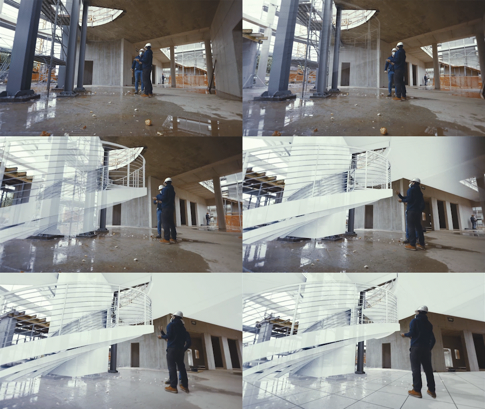
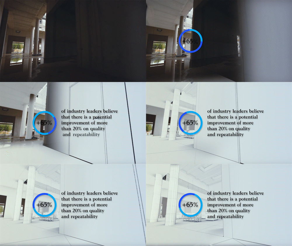
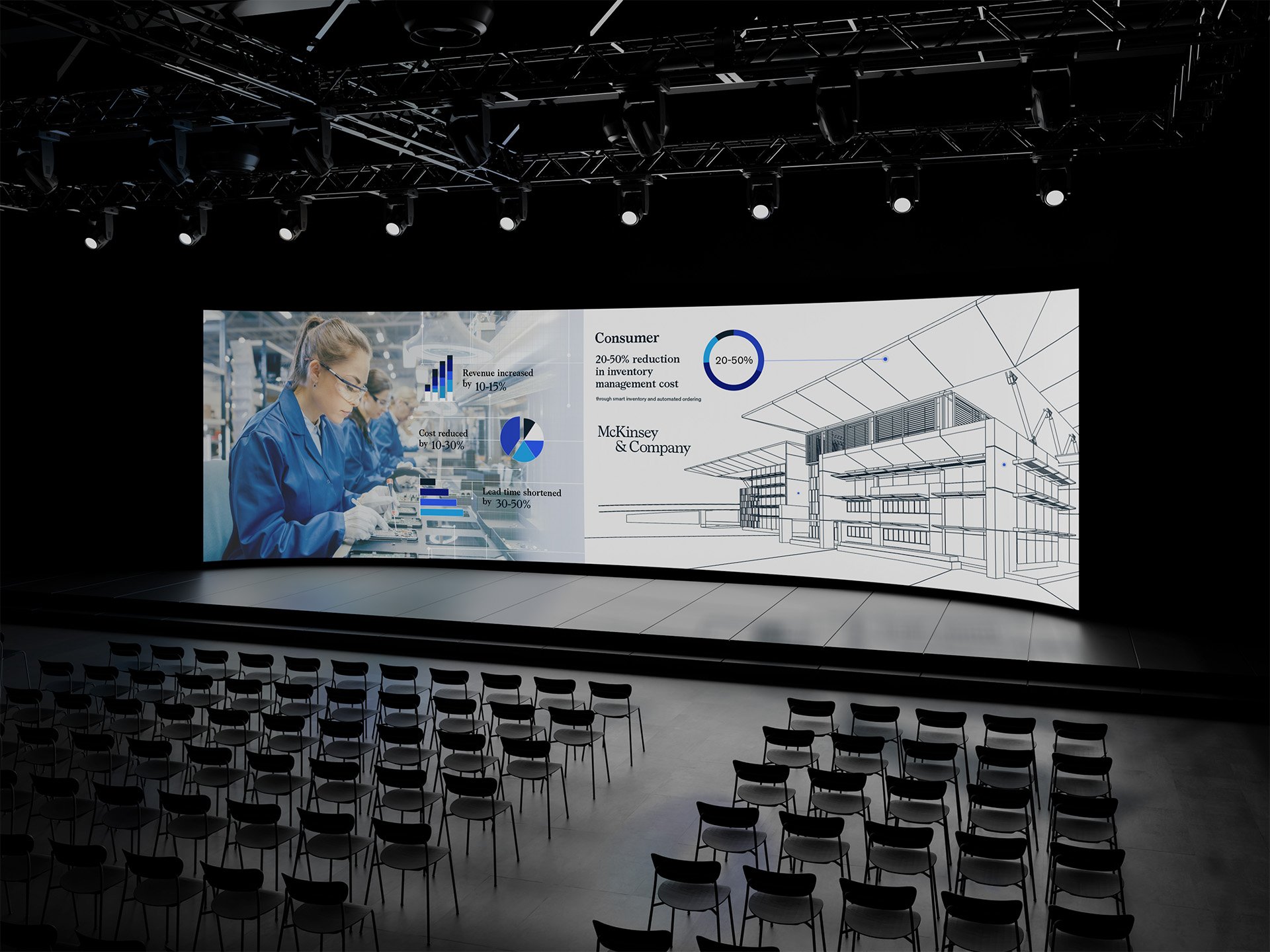
For the project various different styles were pitched to the client. I wanted to to showcase the mix of current state of the building and how the building would look like in the future. Using existing CAD models of the building I worked together with 3D artists and motion designers to align those drawings with the video footage from the building site.
The project scope was three films that would show the different phases of the construction of the learning and innovation center.
The objective
McKinsey & Company were launching a new learning and innovation center in Venice in 2020. They wanted to showcase to their audience what the new center would look like while they were constructing the center.
Part two of the film series
Part three of the film series
Proposed styles for the project
Style 01
2D animation combined with live footage and motion graphics overlay are a potent way to get a message across and keep viewers entertained.
Mood board 01
Style Frame 01
Style Frame 02
Style 02
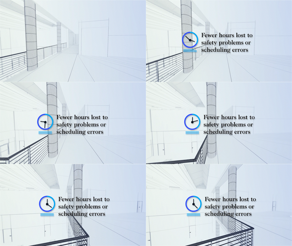
This minimalist approach using architectural 3D models has a premium feel to the style.
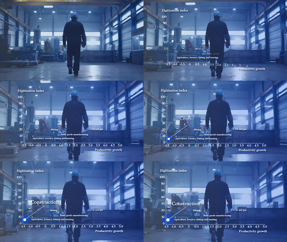
Coloured data points can then be used to highlight the key information for the viewer.
Mood Board 02
Style Frame 01
Style Frame 02
For the final style client wanted to go with a mix of styles 02 and 03. To combine the two different styles some refining needed to be done visually. Moving away from the harsh black and white lined architectural drawing to a softer colour palette that matches better with McKinsey & Company’s brand.


